When you hold a print newsletter in your hands or open up an e-newsletter, what’s the first thing you notice? Is it the high quality writing or the witty humor used throughout? No, it’s the design!
Design is what attracts readers to dive into the content of a newsletter. It’s the “cover” of the book which we always judge first (even if we shouldn’t).
Creating an attractive design is the first step to shaping and producing a newsletter that interests readers. Now you may not be an expert in this so what are some ways to achieve this?
In this blog, I’m going to share with you some of the best practices for newsletter design and ways you can incorporate these ideas into yours.

Have Content Ready
Before even picking up your pen, or mouse, I would recommend having all your content finalized before beginning to design. Having the finished content gives you a more accurate idea of what you’re working with. You'll get frustrated to find out that some of your elements and layouts aren’t going to work because of the length of your content. Plus, you want to make any supporting graphics and elements pertinent to the respective content. You aren’t going to be able to do that ahead of time of receiving or creating the content. I know it’s tempting to dive in and start designing, but you'll ultimately save yourself time by being patient and waiting for the finished copy.
Learn Which Design Program Is The Best Fit For You To Design Your Newsletter
Thoughtful Layout
Since you now have an understanding of the content of the newsletter, you can make educated decisions on how you want to layout everything. How many pages is it gonna be? With an e-newsletter that’s not going to be a concern. But with a print newsletter, this is a pivotal question that you have to answer as it can have many effects on budget.
The most common print newsletter is four 8.5x11 pages. This results in a 11x17 piece that is final folded down to 8.5 x 5.5 to mail. But here’s a dilemma you might face: Do you have enough content for an 11x17? Are you going to have enough content or are you going to be scrambling to fill up the space? If you’re skeptical about reaching that threshold, then you can scale down to an 8.5x11 piece. It would be better to fill up an 8.5x11 with strong content, than an 11x17 with lots of filler stuff. Regardless of which you choose, make that decision beforehand, and save yourself time down the road.
Achieve A Cohesive Look
There are several components to accomplishing a cohesive appearance for your newsletter. These are color scheme, fonts, and consistency. When done well, these aspects can elevate your design from mediocre to excellent.
A foundational aspect of any design element, color scheme plays a huge role. Your company most likely already has a color scheme incorporated in your logo and branding. Remember, your newsletter is an extension of that. It needs to give the same appearance as all your other branding and marketing elements. If you don’t have an established color scheme, then pick three to four colors to form your color palette. If you’re not sure how to do that, Adobe Color is a great free resource to pick one.
Once you’ve decided on a palette, stay true to it throughout. The last thing you want is for your newsletter to look like a circus on paper. Developing a consistent color scheme will help with your brand recognition. Your readers will begin to associate that color scheme with your brand each time they see it in their email or in their mailbox.
I’ve seen a lot of newsletters go bonkers with the amount of fonts they’ve used. It seems that every paragraph has a different font in a different weight.
Here's a pro tip: pick two or three fonts maximum, and stick to them. When you start mixing in seven different fonts, you lose the professional feel that you’ve worked so hard to establish. Plus it becomes harder to read, which increases the chance to lose a reader.
Keep it simple and choose one font for your “body copy” and one for your "headlines.” By utilizing only a couple, you can keep your newsletter legible and easy to distinguish. That’s not to say that you can't use different weights like bold, italic, bold italic, etc… That's fine as long as you keep it within those same two or three fonts. It’s best to choose ones that contrast each other like a serif and sans serif font. For our company newsletter, we use Minion Pro for all the body copy and Avenir Pro for headlines. Another great combination is Open Sans and Bookerly.
When you’re able to apply a central color scheme and simple font combinations, you’re able to develop consistency. This is the ultimate goal of what you’re trying to create. As humans, we like consistency and recognize patterns. Use this to your advantage by crafting a newsletter that can be identified every time by its appearance. Your readers will start anticipate seeing that newsletter in the same format and feel every time. With that consistency, you eliminate one more obstacle or distraction that might prevent them from reading it.
Clear Organization
Walking hand in hand with layout and cohesiveness is organization. Designing an effective newsletter forces you to think about how you organize the content. I like to divide our company newsletter into sections and place my content accordingly. Which content is most important for your readers to read? That should be on the front page then. If it’s something not as important, then page two or three would be best. Think about where you place each item instead of placing things without reason.
After you’ve considered the hierarchy of importance, you can begin to organize content spatially. Give your readers plenty of white space between each section. Your eyes need space and gutters to let your brain know where one section stops and the next starts. Plus, this helps your reader stay focused. Learn more about what makes a newsletter successful.
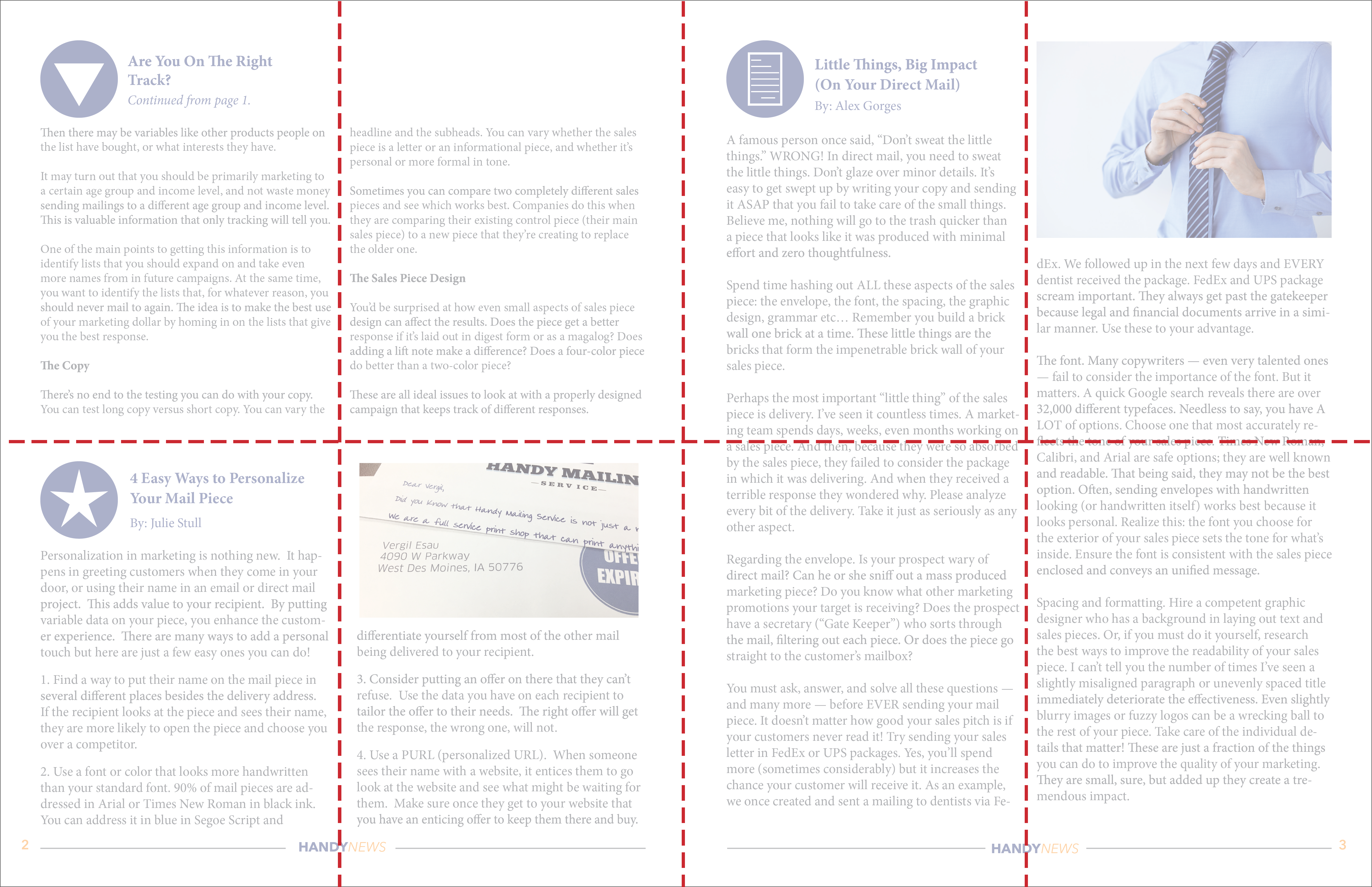
As you’ll see in the illustration below, I organize our newsletter with a grid approach.

Summary Of Best Practices
Let's review what we’ve covered in this article. The three elements to practice in your newsletter design are: thoughtful layout, cohesive look, and clear organization. When executed properly, you increase the appeal and readability of your newsletter. With the goal of getting your readers to actually read what you’ve written, quality design is the hook that draws them in. Now, get to designing!


