Junk, junk... no, Capital One, I’m not interested in opening a credit card... jeez Bed, Bath & Beyond, leave me alone… no, I don’t want to donate more money… wait what’s this? As you dump the rest of the pieces into the trash, you take a closer look at this attractive, sexy, eye-catching, eyebrow raising postcard…
Alright, alright, so I took it a little too far. But isn’t that how we feel sometimes when sorting through the mail? You have your usual suspects that you plan to see once a week that you pay attention to for half a second. But man, when you come across a nice looking postcard, it stops you in your tracks as you examine the contents.
Everybody wants their postcard to be the one that catches attention but too often they end up in the trash with the rest of the junk mail. So how do you get your piece to be the one that survives the purge and even more, prompts the recipient to respond?
Let me share with you three tips to help instantly improve your postcard.
- Catchy Headline
- Color Scheme
- Clear Offer
Catchy Headline
When looking at a postcard, the first place your eyes go to is the headline. Usually, it’s the biggest piece of text because that’s the first thing you want your recipient to read. Concerning placement, I would suggest having it toward the top of the piece because that’s how the eyes read. Left to right and top to bottom. You want it to be super easy for the reader to locate your headline because this is the starting point for selling your postcard. Your headline is the way to get your foot in the door and keep the recipient reading.
Now, regarding the content of your headline, you could go a million and one different ways. So I’ll try to offer a little direction for you. Make it attention grabbing. This is your hook so it must entice the reader to keep reading. It needs to be obvious they will benefit from what you’re offering. Here are a couple good examples: “Make your neighbors jealous with a luscious, green lawn in only 60 days!” or “Enjoy 50% off your next oil change with us!” From the get go, the reader understands what you’re selling and how they can take advantage of this opportunity.
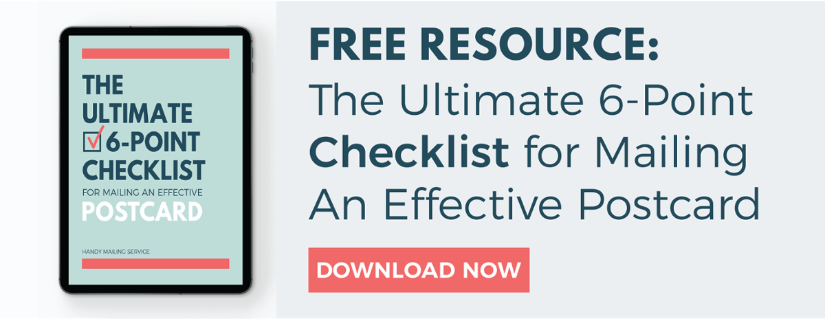
Check out the Ultimate 6 Point Checklist To Mailing A Postcard
Color Scheme
One of the most common mistakes that I see made with postcards are poor color schemes. It’s critical that your postcard needs to stand out from the rest with eye catching and aesthetically pleasing colors. According to Kissmetrics, visual appearance is responsible for 93% of a buying purchase. And consumers say color is 85% of their decision for why they buy a particular product.

When designing your postcard, the first guideline you need to stick to is brand unity. You want to make sure everything a consumer sees or receives from you emanates a common theme or appearance. This will help with your brand recognition and association in the long run. Second, make your color decisions a priority. Don’t allow this to be an afterthought or picked by random. Analyze the different elements in your piece and find ways to incorporate a consistent color scheme that works. If you aren’t sure how to do that, google color palettes, and pick one. Then stick to those 3-5 colors throughout the whole piece. You don’t want your postcard to look like Joseph’s technicolor dream coat or the outside of a circus tent. By sticking to some basic guidelines, I am confident you can create something that will have an positive impact on the reader.
Clear Offer
At the end of the day, the whole purpose of your postcard boils down to this: prompting action. Regardless of if you’re driving prospects to your website or advertising a big sale, you want to motivate the recipient to act. The primary way to do this is with your offer. You’ve led them on a short journey from awareness to consideration so now you need conversion. Providing a strong offer that is easy to understand is the way you can do this.
First, make it easy to locate. This thing needs to be “large and in charge.” The reader should never have to search or squint their eyes for what you’re offering them. The easier they can find it, the better chance they will act on it. You can achieve this by creating a burst graphic, or a “clip out rectangle” or a strong contrast in color. You need to lead their eyes toward it so do whatever you need to for that to happen. Second, make it easy to understand. Nothing is worse than seeing an offer that you can’t quite understand what is being offered. Let them know how you want them to respond. If you want them to go to your website provide the URL nice and big. Or, if you want them to bring the postcard into the store, write that in big bold letters. If your reader has to work hard to find out how to respond, you’re shooting yourself in the foot. Make it simple and obvious for them to respond.